Buttons
Button bar

A bar which contains the buttons for the particular page. Generally it is
sitiated on top of the page below the page title. Button bars contains action
buttons.
Action button
An element that provides the user a simple way to trigger an event applied to the action / page.
Each action button in Webdesk application has the corresponding icon as an additional way of describing the corresponding to the button event.
Action buttons are situated in the button bar.
Primary action button
Primary action button is a specific type of the button which indicates / highlights the main action for the particular page.
There is no functional difference between the primary action button and an action button.
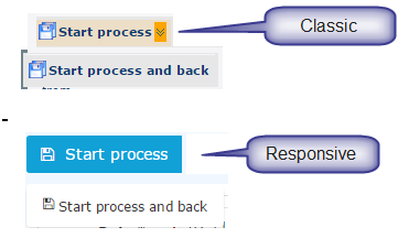
(Action) button dropdowns

An action button with an additional options. Generally the button have a
dropdown with the list of options which are logically connected.
The dropdown button has a two arrows symbol (classic skin) or a caret (responsive skin) on the right. Clicking on the button itself triggers the event associated with the button. Clicking on the arrows / caret initiates the appearance of the drop-down with the list of additional possible actions.
Some dropdown buttons have slightly different behavior: clicking the button itself does not trigger any event except the appearance of the dropdown with additional actions.
Buttons and primary buttons can have dropdowns.
Embedded action buttons
| Vergrößern |
Action buttons that are situated in the button bar inside a tab or a sub-tab.
Export (action) buttons

Button group with different possibilities to export the data from the particular
page.
Currently there are the following exporting options:
- Print - opens the page in the Print view
- PDF export - allows exporting the data in the .pdf format
- Excel export - allows exporting the data in the .xls format
Input button

Button that belongs to an input group: i.e. this button triggers the specific
event for the particular input field. The most common event is calling
the Dialog.
Note. Buttons for date and time pickers are also input buttons, but because of the date- and time-pickers are specific input elements they are described in a separate section. Please, see below.
Row editing buttons
| Classic: | Responsive: | ||||||||
|
|
Represent the actions that can be applied to a specific item. Mostly used in tables or simple data lists for applying the action to a particular item in the table row.
Examples are: edit item, remove item, leave a comment to the workflow step, continue the effort, etc.
(Simple) button
An element that provides the user a simple way to trigger an event within a form, tab, sub-tab but not the event for the action.
Keine Kommentare vorhanden.